Who? What? Where? When? and Why are you telling me this?
These are the five questions that my late father, George Short, used to say must be answered in the first paragraph of any good news story. He was Training Editor for Reuters, one of the world’s largest news-gathering organisations.
(And his many wise and witty words of advice come to my mind nearly every day, even 20 years after his death…)
At Demand Logic, the clean-tech web startup we formed a few years ago, I now have the wonderful privilege of being able to dream up and lead development on new ‘user experiences’ — data-driven web pages designed to help save energy and increase performance of buildings. And it occurred to me that what we are actually striving towards is good “visual journalism”. In other words our job should be to lay before our users the ‘headline news’ about the buildings they manage.
However complex the underlying systems (did you know that the typical building depends on the smooth inter-operation of up to a thousand items of machinery?), Demand Logic’s goal is to lead the eyes of both busy managers and data-hungry engineers towards the top story — those few items of plant that are letting the side down. Or that single controls tweak that could lead to 6-figure annual savings. (Yes, believe it or not, we find those all the time…)
Since we formed the company, we have been building the back-bone: the solid technologies capable of harvesting, storing, retrieving and processing staggering amounts of building services data. We are now streaming around 40 million values each day. And already we are providing several hundred users with novel insights about how their building systems are behaving.
But we’ve really only just started to scratch the surface in terms of visual communications. Although there’s more to do on our core systems to increase data-processing capability, we now have a huge data-crunching resource that we can use to drive some real visual creativity.
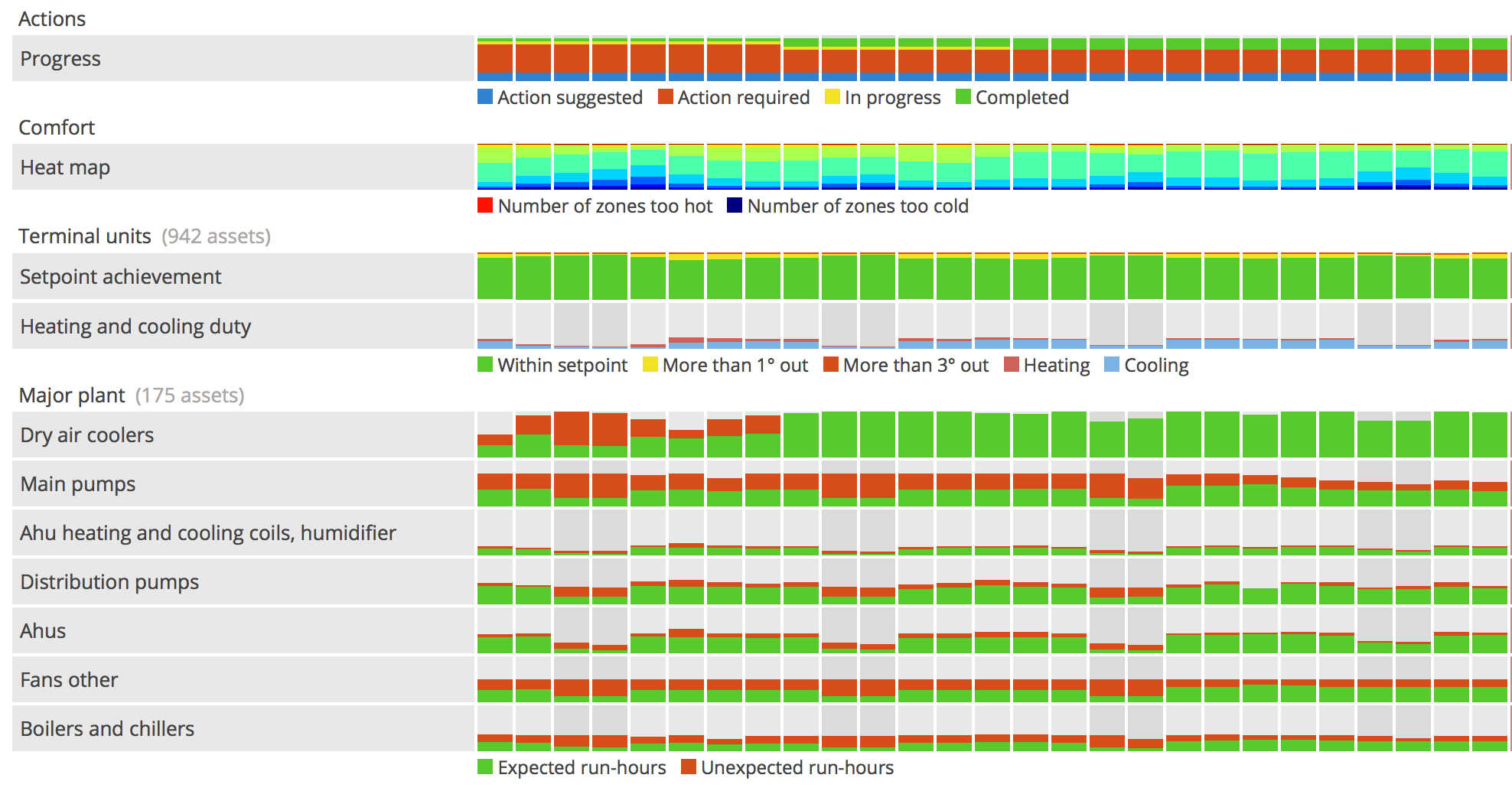
When ‘debugging’ a building to find where the wastage is coming from, you need to see several stories at once. The summary view below, released recently, gives a taste of the other kinds of data we collect and display.
Over the coming months we’ll be having a lot of fun trying out more visual approaches — working out how to give those busy folks who manage complex buildings the ‘top story’. Watch this space!