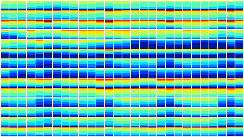
This image shows 28 days of space temperatures in 14 office buildings (taken at random from buildings monitored by our startup, Demand Logic). Each row is a building. Each box shows a day. The heights of the blueish areas show the portion of rooms in the building that were getting a little cold on that day. Converse for red. Around 6.8 million temperature samples were used to create this image. It represents the daily comfort of about 15,000 people!
It’s a nice demo of how much data we’re streaming from buildings and how many opportunities there are now for new visualisations.
I used this shot in a short talk at a recent Ashden “After Work” event and it seemed to go down well. It’s compiled from a new summary view we’re working on to give people an instant glance of their building performance. (With our nice clear headings and legends removed to add a little mystery for the talk…)